What you are going to learn
- Playing animations using CSS, without JavaScript
- Playing animations using JavaScript
You want to learn how to create CSS sprites with TexturePacker? How to display a sprite, and how to display another sprite when it's hovered over with the mouse?
All of this is explained in our Creating CSS sprites with TexturePacker tutorial!
Play animation with CSS
Simple animations in CSS have some benefits over animations in JavaScript:
- They're easy to use: you don't even have to know JavaScript.
- The animation runs smoothly, even under moderate system load.
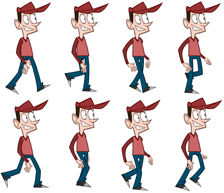
To display a sequence of animation frames with CSS, you need a sprite sheet that includes all animation frames. It's important that all sprite frames have the same size:

The easiest way to create a sprite sheet and its corresponding CSS file is by using TexturePacker — available for Windows, macOS and Linux. Ensure that you have TexturePacker version 7.1 or newer, as older versions do not support the export of CSS animation rules.
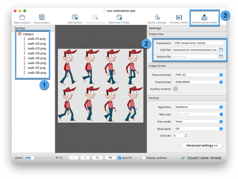
Start TexturePacker and create a sprite sheet with the following three steps:
- Drag and drop your sprites on the left sidebar.
- Select the CSS (responsive, retina) framework and specify the CSS file name. You can leave the texture file name empty, then it will be stored next to the CSS file.
- Press Publish to export the sprite sheet.

The option Auto-detect animations on the Advanced settings page is enabled by default. TexturePacker automatically identifies sprite names that only differ by a sequence number and exports additional CSS animation rules for them.
In our example, TexturePacker generates the CSS selector walk-animation,
which can easily be used to play the animation:
<div class="walk-animation"/>To adjust the animation speed, you can override the animation-duration property in your own CSS file:
.walk-animation::after {
    animation-duration: 3s;
}
Animate sprites with JavaScript
There are several options how to animate a sprite with JavaScript. Here's a way to do it with pure Javascript. But you can of course also use one of the many JavaScript frameworks...
function animate()
{
    const animatedElements = document.querySelectorAll(".animation");

    animatedElements.forEach(el => {
        const frameDuration = el.dataset.frameDuration || 100;
        const frameNames = el.dataset.frames.split(",");
        el.classList.add(frameNames[0]);

        setInterval(() => {
            let frame = el.dataset.currentFrame || 0;
            el.classList.remove(frameNames[frame]);

            frame = (++frame) % frameNames.length;

            el.classList.add(frameNames[frame]);
            el.dataset.currentFrame = frame;
        }, frameDuration);
    });
}
Include the CSS file published with TexturePacker and the JavaScript file in your HTML.
Then add elements with CSS class animation and start the animations by calling animate():
<html>
    <head>
        <link rel="stylesheet" href="sprite-sheet.css">
        <script src="js-animation.js"></script>
    </head>
    <body>
        <i class="animation" data-frame-duration="100" data-frames="betty-RunLeft0001,betty-RunLeft0002,betty-RunLeft0003,betty-RunLeft0004,betty-RunLeft0005,betty-RunLeft0006"></i>
        <i class="animation" data-frame-duration="150" data-frames="capguy-walk-01,capguy-walk-02,capguy-walk-03,capguy-walk-04,capguy-walk-05,capguy-walk-06,capguy-walk-07,capguy-walk-08"></i>
        <script>animate()</script>
    </body>
</html>
Add the following attributes to the items you want to animate:
class="animation"— required for the script to detect animationsdata-frame-duration="33"— the delay between frames in msdata-frames="frame1,frame2,..."— a comma separated list of animation frames
As the Javascript implementation doesn't rely on the CSS rules generated by TexturePacker for animations, you can disable the option Auto-detect animations on the Advanced settings page of TexturePacker. This will help reduce the size of the generated CSS file.
